
What colors go with orange?
In the vibrant world of color psychology, orange is a hue that attracts attention and energizes the mind. Its warm and uplifting qualities make it an ideal choice for creative endeavors, evoking feelings of excitement and optimism. But when it comes to finding the perfect pairings for orange, there's a science behind it that can increase your color impact.
Orange, with its captivating brightness, is often referred to as the colour of creativity. It stimulates the imagination and promotes communication, making it an ideal choice for brands looking to convey a sense of innovation or excitement. Understanding the science of color and psychology behind it allows us to create visually compelling designs that resonate with our target audience.
The psychology of orange
Before delving into the world of color combinations, it is necessary to understand the psychology behind orange. Orange is one colour which combines the energy of red and the happiness of yellow, resulting in a vibrant hue that commands attention. It is associated with characteristics such as excitement, creativity and adventure.
In terms of emotions, orange evokes feelings of warmth, optimism and joy. It can lift moods and stimulate mental activity, making it an excellent choice for environments where creativity and communication are valued. Orange is often used in marketing and branding to create a sense of excitement and draw attention to products or services.
Understanding color pairs
When it comes to combining orange with others colors, there are several strategies to consider. The goal is to create harmonious combinations that enhance the effect of orange while maintaining visual balance. Let's explore some of the most effective color combinations for orange.
Complementary colors for orange
The supplementary ones colors are the hues that are opposite each other on the color wheel. For orange, the complementary color is blue. The combination of orange and blue creates a striking contrast that is visually appealing. This combination is often used in sports team logos and branding to create a sense of energy and excitement.
When using orange and blue together, it's important to consider the intensity of each color. A bright orange paired with a deep blue can create a bold and striking effect, while a softer shade of orange paired with a lighter blue can create a more subtle and relaxing combination.
Similar colors for orange
Depending colors are the hues that are adjacent to each other on the color wheel. For orange, the corresponding colors are yellow and red. The combination of orange with these colors creates a harmonious and cohesive palette. This combination is often used in internal decoration to create warm and welcoming spaces.
When using analogues colors with orange, it's important to consider the hue and tone of each color. A vibrant orange combined with a bright yellow and a deep red can create a lively and energetic atmosphere, while a softer shade of orange with a soft yellow and a rose red can create a more relaxing and comforting atmosphere.
Triad colors for orange
The triads colors are hues that are evenly distributed around the color wheel. For orange, the triad colors are green and purple. The combination of orange with these colors creates a vibrant and balanced color scheme. This combination is often used in graphic design to create visually striking compositions.
When using triad colors with orange, it is important to consider the balance between warm and cool tones. A bright orange combined with a vibrant green and a deep purple can create a dynamic and striking design, while a softer shade of orange with a soft green and a lavender purple can create a more subtle and harmonious composition.
Separate complementary colors for orange
The separated complements colors is a variation of complementary colors. Instead of using the exact opposite color, split complementary colors use the two colors on either side of the complementary color. For orange, the divisible-complementary colors are blue-green and blue-purple.
The combination of orange with these colors creates a unique and balanced color combination that offers a little more variety and nuances compared to traditional complementary pairs. This combination is often used in fashion and interior design to create visually interesting and sophisticated looks.
When you use split complements colors with orange, it is important to consider the balance between warm and cool tones. A bright orange combined with a vibrant blue-green and a deep blue-purple can create a bold and eclectic design, while a softer shade of orange with a soft blue-green and a lavender blue-purple can create a more delicate and elegant composition.
Use of orange in branding and marketing
Now that we've explored various color combinations for orange, let's discuss how orange can be used effectively in branding and marketing. Orange is an attention grabbing color and conveys a sense of excitement and enthusiasm. It can be used to create a strong visual identity for a brand and leave a lasting impression on consumers.
Many well-known brands use orange in their logos and marketing materials to evoke a sense of energy and creativity. Examples include the famous orange logo of the telecommunications company Orange and the vibrant orange used by the fast food chain McDonald's. These brands understand the power of orange to grab attention and create a memorable brand image.
When using orange in branding and marketing, it is essential to consider the target audience and desired message. Orange may not be appropriate for all industries or demographics, so it's important to evaluate how the color aligns with the brand's values and target market. In addition, the specific shade and tone of orange should be carefully chosen to convey the desired feelings and associations.
Applying orange color palettes to the design
Now that we've explored the psychology and pairings of orange, let's discuss how to apply orange color palettes to design. Whether you are a graphic designer creating visual compositions or an interior designer creating welcoming spaces, understanding how to use orange effectively can have a significant impact on the overall design.
In graphic design, orange can be used as the dominant color or as an accent to create visual interest. When using orange as a dominant color, it is important to balance it with neutral tones or complements colors to avoid overdoing the design. Using orange as an accent color can add vibrancy and draw attention to specific elements of the composition.
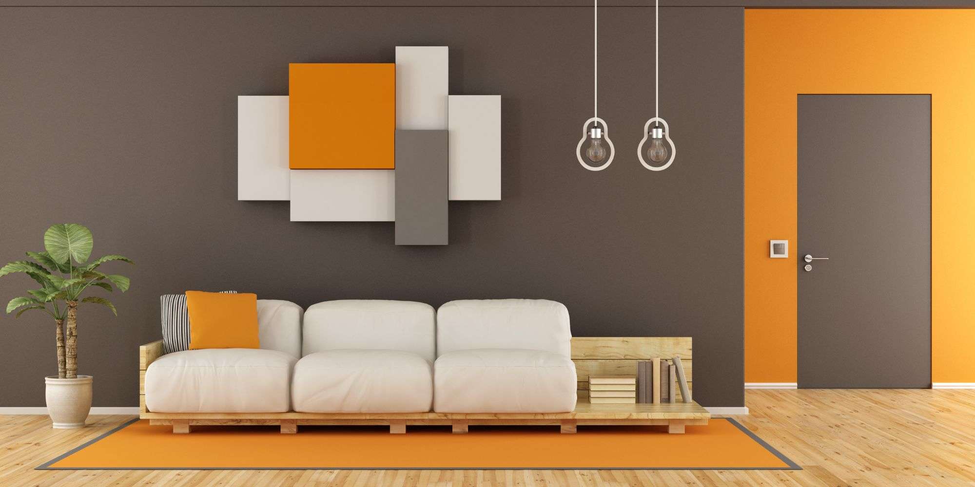
In interior design, orange can be used to create focal points or to add warmth and energy to a space. It can be integrated with paint colors, furniture, accessories or artwork. When using orange in interior design, it is important to consider the size and lighting of the space. A large and well-lit room can handle bolder shades of orange, while smaller or dimly lit spaces can benefit from softer, lighter hues.
Conclusion: Embracing the power of orange
In conclusion, orange is a color that attracts attention and energizes the mind. Its warm and refreshing qualities make it an ideal choice for creative and branding efforts. By understanding the science of color and the psychology behind it, we can create visually compelling designs that resonate with our target audience.